by Nick Estes
Sept. 1, 2011
Politicos on both sides of the aisle make accusations about the “other side” all the time. What’s almost as bad as the ugly partisanship is the fact that they’re making very simple claims about very complex subjects. So it’s refreshing when some group puts down the basic facts in a simple-to-follow format like the charts referred to below, which have lately been making the rounds on the Internet.
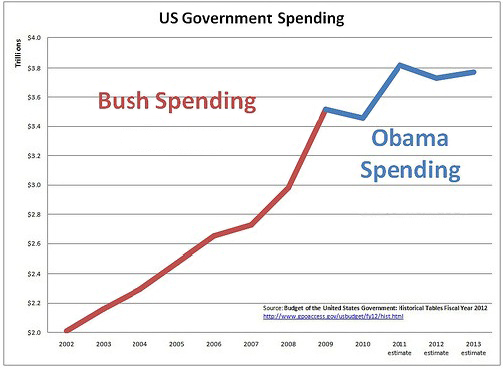
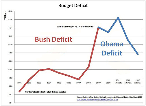
Given the acrimony expressed in the current debate around deficit spending and the federal debt – this seems like a good place to start. Since they’re somewhat connected, we’ll look at the first two charts together: spending and deficits.
Two points have been conspicuously absent from the national debate about spending and deficits: 1. the cause of the deficit, and 2. what we gained from the spending. During the Bush Administration, the bulk of the deficit spending was caused by two things: tax cuts and wars – neither of which was “paid for” by increases in other taxes or cuts to other spending. The income tax cuts overwhelmingly benefited the wealthiest Americans so what we “gained” from them was greater wealth inequality. In terms of the gap between the richest and the poorest, we’re starting to look more like a Third-World country and less like a global superpower whose main strength lies with its vibrant middle class.
Regardless of what you think of the wars, One thing is irrefutable – although the U.S. has often fought wars on credit before, this was the first time in our nation’s history that wars and tax cuts went hand-in-hand.
Note that the biggest jump in the federal deficit began in 2007, and that points to the biggest underlying cause of the current federal debt – the recession. Notice that I wrote ‘recession’ and not ‘economic stimulus.’ That’s because when the economy tanks, so does the revenue the government receives in the way of income taxes. Unless spending is cut to match the decrease in revenue – a very bad idea during a recession – the loss of revenue increases the debt.
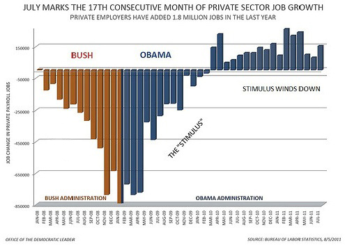
Finally, we’ll tackle the oft-made claim that President Obama’s stimulus program “failed.” This is nonsense. The Congressional Budget Office says it preserved or created 1.5 to 3 million jobs. The third chart shows the effect of the stimulus in turning around the job losses due to the Great Recession. It shows the number of jobs lost or gained every month since the beginning of 2008 and up to July 2011.
Under President Bush, the monthly job losses got to be worse and worse. Under President Obama, the loss rate stabilized for a few months and then, in early 2010, private-sector jobs began to grow. This was due to spending on safety net programs like unemployment insurance and Medicaid and the stimulus program – both of which put more money into the economy. The chart shows dramatically how these factors helped stop the slide into another Great Depression.
The chart also shows that while the stimulus helped the economy level off, it turned out to be not enough. Unemployment has leveled off at about 9 percent, but that is much too high. That cold number masks millions of families who are suffering every day because their breadwinners can’t find jobs. So we have to do more. Another stimulus is clearly called for because it will cause the bars representing job gains to raise higher – enough to bring down the rate of unemployment. This will add to the short-term federal budget deficit, but energizing the economy will help us pay down the national debt later, when the economy is doing better. Only then should we take a serious look at slowing spending and paying down the debt. To do so before the economy recovers would be disastrous – as several European counties have already learned.
Nick Estes is NM Voices’ Deputy Policy Director


